TAS
A Tea Adventure
The Tea Appreciation Society (TAS) is known for its exquisite and refined taste of all things tea. They are a club dedicated to enlightening others to the wonderful taste and benefits of drinking a well-made cup of tea.
Role
As the Marketing Director, I was responsible for developing our brand visuals and bringing them to life.
Deliverables
Visual identity
Social media graphics
Objective
TAS approached me with the desire to create a consistent and reformed branding guideline for their marketing material that aligned with their sophisticated nature.
-
As the marketing director, it was my job to decide on an overarching theme that all designs would adhere to. The club also placed emphasis on their inclusivity and welcoming nature, which I chose to highlight by creating varying designs that clearly showed that they were made by multiple people. As a club, its members and its people were most important.
I knew I needed to approach this differently than a typical branding project. With the varying needs of the club, I decided on creating a general encompassing direction of design guide, rather than strict rules. This differed to that of a typical brand style guide which has several fonts and colours used consistently.
-
Since each post could be about a tea quote, recipe, or promoting tea events, there needed to be a variation in our style to conform to any possible post needed. There were also various types of tea events that TAS could hold, which meant balancing between creating a design consistent to the others, whilst also highlighting the core of the event.
Another challenge was the team-based aspect of this project. Since there were several of us designing the posts, without a brand style guide, the posts could appear inconsistent.
-
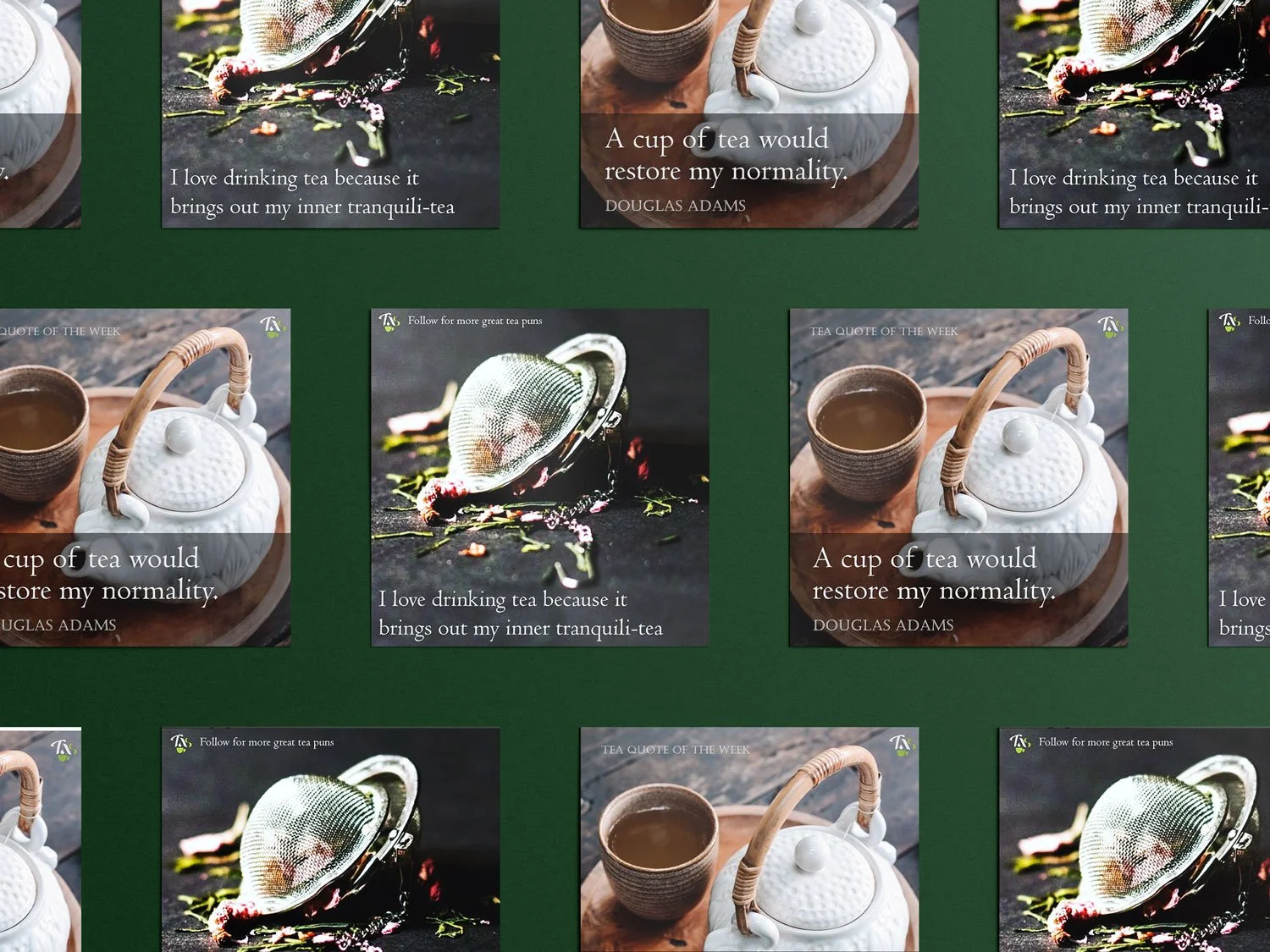
Therefore, I chose to focus on creating a mood for our designs. Through scrolling our Instagram feed, a TAS member will be welcomed with a dark green overlay that centered around a tea image as the focal point. Posts concerning upcoming events were lighter, so as to draw attention to the event, but still maintained the dark green overlay on an image.
Typefaces were chosen on a post-by-post basis, to ensure the right message was portrayed for each post. However important posts containing information about events or tea tips included a sans serif typeface to ensure readability and legibility. Other forms of posts such as tea recipes and tea quotes were mostly written in a serif typeface to maintain an air of class and formality.


