Supersake Vic
Sophisticated Sake for the High-End Palette
Role
Marketing design
Deliverables
Social media graphics
Supersake Vic is known for serving its customers with high-end, premium sake made from Japan. They pride themselves on their diverse range of tastes to suit every sake drinkers - from the experienced sake expert, to the new sake novice.
Objective
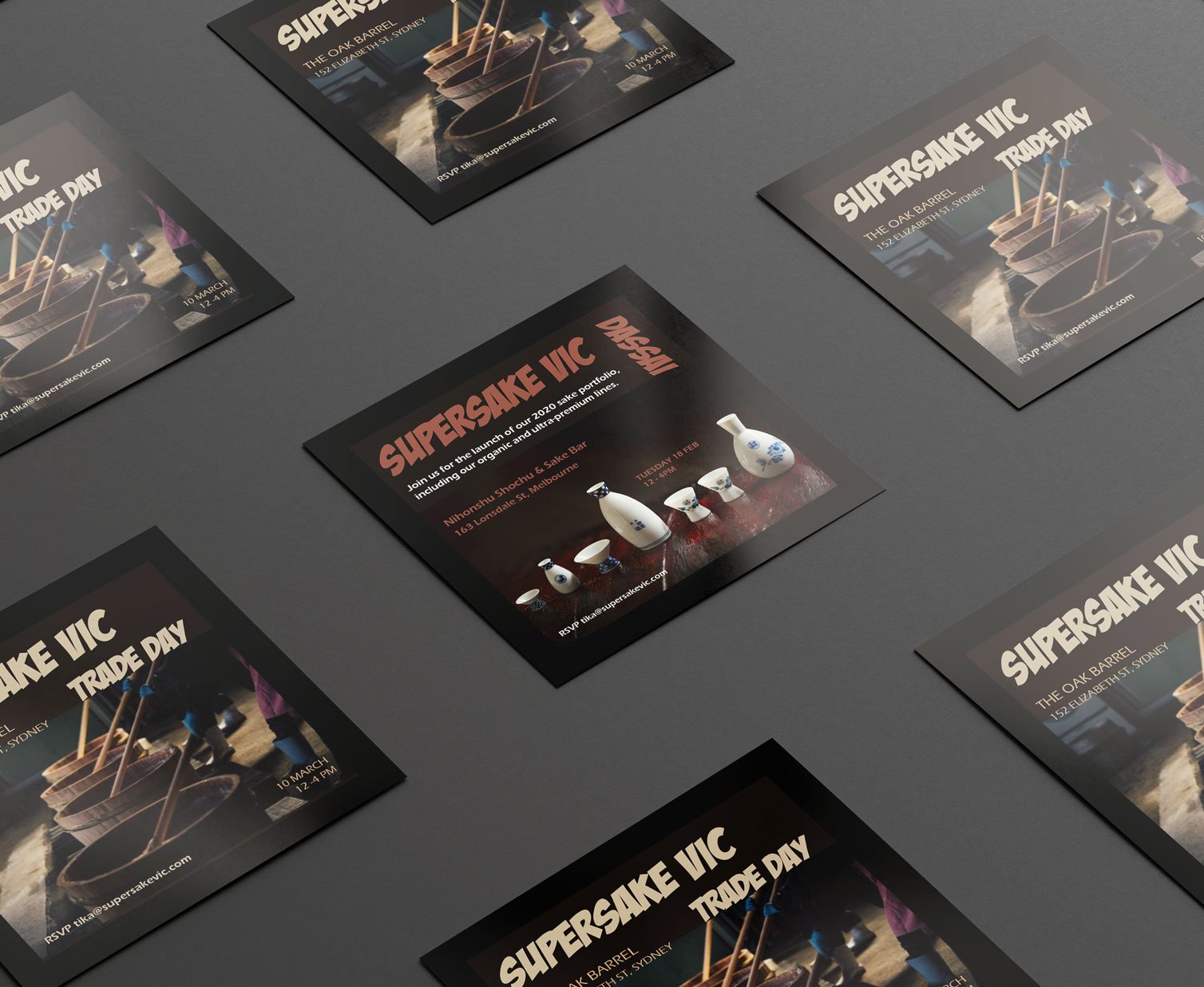
With two upcoming trade days, they approached me to create a welcoming flyer design and two social media posts.
-
As a premium brand, Supersake Vic wanted the designs to convey the sophistication and premium nature of the brand.
I worked closely with them, brainstorming concepts and understand their target audience.
Through this, I learnt that they were after a design that conveyed a sense of warmth and openness, as the trade days were an opportunity to present themselves in a new market.
-
As a brand with no consistent marketing or branding style, this served as a unique opportunity, but also had its challenges. This meant that I was free to design whatever design style that served the brand, but it also meant that I had no consistent starting point to reference from.
-
As a starting point, I selected elements which I knew would convey the brand messaging. As a premium brand, I chose black as the main feature colour, as this would show their sophistication. This formed the basis for my selection of other colours, and especially the selected images.
Supersake Vic also wanted to convey their warmth and openness as a business. To accomplish this, I was able to include some behind-the-scenes images in the marketing collateral. By carefully selecting from their image catalogue, I was able to connect the message of the flyer and the openness of the brand.


